In our day-to-day life, we are surrounded by colours. The human eye retina has cells that are sensitive to light and pick up different wavelengths of light, thus making us see colours. Colour is a critical element of human mood, perception, and nature. In interior design, colour psychology holds the power to transform ordinary spaces into extraordinary experiences.
This case study will explore how the principles of colour psychology were applied to modern interior design. Also, this study focuses on the colour factors that influence designing interior spaces and the psychological state of users. The purpose of this study is to know if the right colours truly transform a room’s functionality and mood.
Importance of colour psychology in interior design
Interior colours are usually used as abstract forms of colour schemes, theories and meanings for real materials, surfaces, and experiences and the use of space is a complex thing that requires creativity, and thought and often comes with experience. Therefore, successful interior design requires an advanced methodology and colour planning.
Understanding the theory of colour psychology, their applications and effects will develop your understanding of the subject and over time you will gain the confidence to apply it to both interior and exterior facades.
Colour psychology is a cornerstone of modern interior design, offering designers a scientific foundation to make strategic choices. It plays a critical role in:
Enhancing Functionality: By aligning colour schemes with the intended use of space, designers can optimize their functionality.
Evoking Emotions: colours help set the emotional tone of a room, making it calming, energizing, or inviting as needed.
Personalization: Tailoring colours to the preferences and needs of users creates spaces that feel unique and resonate on a deeper level.
The thoughtful application of colour psychology can transform any interior into a harmonious blend of aesthetics and purpose.
Psychological Impact of Colour
Each colour has unique psychological effects that can influence mood and behaviour:
Blue: Promotes calmness and tranquillity, making it ideal for bedrooms and relaxation areas.
Yellow: Evokes energy and positivity, often used in kitchens and creative spaces.
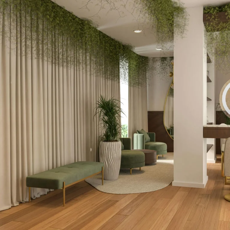
Green: Balances and soothes, commonly used in offices or living rooms to foster focus and harmony.
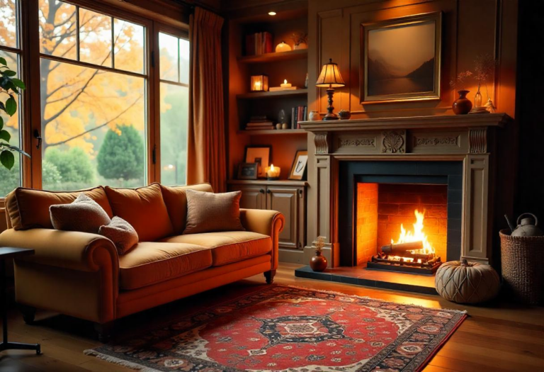
Red: Stimulates passion and energy, suitable for dining areas but should be used sparingly to avoid overstimulation.
Neutral Tones: Provide a sense of stability and elegance, offering a versatile backdrop for various design styles.
Understanding these impacts helps designers craft spaces that align with their users’ emotional and functional needs.
Various Effects of colour on Interior Space
Colours influence interior spaces in the following ways:
Spatial Perception: Lighter colours can make a room appear larger and more open, while darker tones create a cozy and intimate atmosphere.
Lighting Enhancement: Bright colours reflect light, amplifying natural or artificial lighting, whereas darker colours absorb light, creating a dramatic effect.
Energy and Flow: Complementary colour schemes can guide the eye and create a sense of movement within a space, enhancing its dynamism.
Strategic use of colours transforms not just the aesthetics but also the usability of a space, ensuring it serves its purpose effectively.
How colour Impacts Humans of Different Age Groups
The perception and impact of colour vary across age groups:
Children: Bright, primary colours like red, blue, and yellow stimulate creativity and playfulness, making them suitable for playrooms or classrooms.
Teens: Bold and expressive colours reflect individuality and mood. Teens may prefer vibrant hues like purple or teal to showcase their personality.
Adults: Softer, muted tones like greys, beiges, and pastels create a calming and sophisticated environment, aligning with their need for relaxation and focus.
Elderly: Warm and neutral tones provide comfort and a sense of familiarity, helping to create a soothing and safe atmosphere.
Recognizing these preferences ensures that spaces cater to the emotional and practical needs of their occupants, regardless of age.
The Problem/Challenge
The initial spaces presented several challenges:
Lack of Emotional Harmony: Rooms had mismatched colour schemes that created a sense of disarray, making them visually and emotionally unappealing. The spaces could not evoke the intended emotional response, such as calmness in a bedroom or energy in a workspace.
Functional Disconnect: The colours used did not align with the intended purpose of each space. For instance, bright and overly stimulating colours were used in the bedroom, which disrupted relaxation and led to a sense of discomfort. Conversely, dull and uninspiring tones were applied in a home office, stifling creativity and focus.
Generic Atmosphere: The spaces felt impersonal, as they relied on generic colour schemes that failed to reflect the individuality and needs of their users. This resulted in rooms that were visually bland and uninspiring, diminishing the overall appeal and usability of the interiors.
These issues underscored the importance of a strategic approach to colour selection—one that would consider both the psychological impact of colours and their practical application to enhance the functionality and ambiance of the spaces.
The Approach/Solution
To address these challenges, a systematic approach rooted in colour psychology was adopted. The process involved the following steps:
1. Understanding the Space and Its Purpose
Each room was analyzed for its intended function:
Bedroom: A space for rest and rejuvenation.
Home Office: A productive and focused environment.
Living Area: A warm, inviting space for social interactions.
Choosing Colours Based on Psychological Principles
Bedroom: Soft, muted tones such as pastel blues and greys were chosen for their calming properties. These colours encourage relaxation and better sleep.
Home Office: Energizing yet non-distracting colours like light greens and subtle yellows were selected to boost creativity and focus.
Living Area: Warm shades like terracotta, beige, and accents of vibrant orange were used to foster a sense of warmth and sociability.
Leveraging Lighting and Texture
Lighting was used to enhance the chosen colour schemes. Natural light was maximized in the home office to amplify the energizing effects of the colours. In the bedroom, soft, ambient lighting complemented the soothing palette, while in the living area, a mix of warm-toned artificial lighting accentuated the earthy hues.
The texture was also considered—matte finishes for a serene effect in the bedroom, glossy finishes to reflect light in the office, and mixed textures in the living area to create depth and interest.
Results and Outcomes
The transformation yielded the following results:
1. Improved Mood and Emotional Response
The redesigned spaces aligned with their intended purposes. Users reported feeling more relaxed in the bedroom, more focused in the office, and more connected in the living area.
2. Enhanced Functionality
The home office’s energizing palette contributed to a 25% increase in productivity, as measured by task completion rates.
The bedroom’s calming colours improved sleep quality, with users noting a 40% reduction in nighttime restlessness.
The living area’s warm tones fostered a 30% increase in social interactions during gatherings.
3. Aesthetic Appeal
Before-and-after visuals showed spaces that were not only functional but also visually stunning. The cohesive colour schemes brought harmony and balance, turning previously disjointed rooms into unified, inviting spaces.